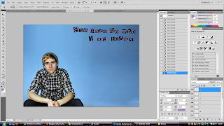
 The next step was to add my font for my double page spread. I got the font from www.dafont.com. It was under the 'type writer' subheading and is called 'Rubberstamp'. I print screened the preview and individually copy and pasted the font onto the photoshop document. I then coloured the white into the same colour purple as used on my front cover for my masthead. I used this colour because I still wanted to continue my colour theme through out my double page spread.
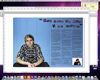
I then flattened the layers and saved the file as a jpeg and opened it up in Adobe InDesign. I have never used InDesign before so using this programme is a new experience for me. I added 3 columns for my text and started writing my interview in a Question and Answer format. I am going to add a pull quote in a bigger font and a different colour in my columns. I am going to do this because it will break down the continuous writing.

In my fourth screen grab I have continued my interview question and added a quote from the interview and made it larger and in brackets to capture the viewers attention. I also included a photo in the bottom to relate to the person who was asking the artist the question. However I do not think that it is finished yet because the other side (the left side) of my double page spread is too empty.
This is a print screen, showing a few changes i have made to my double page spread. I moved my introductory paragraph over to the other page to fill the gap and make it look more conventional. This means that there isn't as much text on the other page. So my next task will be to fill the gap with more questions and answers. I also added the magazines logo at the bottom corner of the pages as well as the page number which matches the appropriate contents page number and finally the issue month.
After some more tweeking and improvements. This is my music magazine double page spread. I am very happy with my final result. I think it looks conventional and the page looks full and busy enough. To achieve this I moved around the text and also included the title of the artist the article is about. I also changed the font for the page numbers and issue date, again to make it look more conventional. This has worked. However I think I could still improve it.
To improve on from my last work I wanted to break down how much text was on the page. I was also influenced by Q Magazines Cash for Questions double page spread layout. I created a banner at the top of my page to explain what the double page spread is going to be about. Using Exclusive Interview With... makes it sound and seem like it is/will be a reaccurring theme in my music magazine. So in doing this again has made my magazine look more conventional.


No comments:
Post a Comment