Tuesday 5 April 2011

Evaluation - Question 7

Question 7: Looking back at your preliminary task, what do you feel you have learnt in the progression from it to the full product?

SWOT Analysis
These are a few bullet points of what I feel I have learnt from my preliminary task to improve my music magazine (full product).

Strengths
  • I have improved my knowledge of using the Macs. When creating my Preliminary Student Magazine task I had never used a Mac before. So hence using them for my Preliminary Task meant that I developed my skills dramatically, and with feeling more confident using the Macs, I feel my full product benefited from this.
  • A second strength again is with Photoshop. Although I had previously used to software using it 3 or 4 times a week really pushed my skills and I even felt comfortable using new tools that I had not used in my Preliminary task for my Full Product. An example of this is the magnetic lasso. 
  • A third strength is that I learnt from my Preliminary Task that I needed to leave and give myself more time to get more photos for my magazine as well as plan what I was going to photography and how. And that is what I did for my Music Magazine, I planned in advance my shoots and took more photos to gain choices from.
Weaknesses
  • One of my biggest weaknesses was that I had to use a program that I personally have never used before. It was called InDesign. Although made by the same company as Photoshop, I found InDesign hard to use and time consuming.
  • Another weakness was my model. After photographing them for my Front Cover they decided that they didn't want their photos taken and used on my Double Page Spread. This caused a problem and at one stage made me behind on my work. However I managed to convince my model to allow me to photograph them again.
  • I didn't have a third weakness.
Opportunity
  •  One opportunity was that i had previous experience with using Photoshop. Therefore I found it easy to edit my photos and images that I was going to use. An example of a tool I knew how to use was the brightness/darkness and curves tool. Under the 'Image' header.
  • Another opportunity was I found it easy to set up a composition and the correct composition for the front covers for both the Preliminary and Full Product. I found this easy to do because I had previously studied Photography GCSE and I currently study A Level Photography. This also meant that I knew how to set up the correct settings on the camera.
  • A third opportunity was that I had the Internet at all times which meant I could easily find and compare my Preliminary Magazine with a real magazine. I used this to my advantage and this helped me plan my layout with the correct forms and conventions of real media products. This prevented me spending more time with sorting out my layout and meant I could spent more time with improving my graphical skills.
Threats

  • One threat was that the Mac's kept crashing which was something that wasn't in my control.
  • A second threat was that doing my Preliminary Task didn't help me with how to create a conventional Music Magazine as the layout is completely different and the ingredients are also different and not similar.
  • A third threat was I have never made a double page spread before and therefore I had no past experience of how to do this. 

Monday 4 April 2011

Evaluation - Question 6

Question 6: What have you learnt about technologies from the process of constructing this product?

Technology and the magazine industry
I believe that technology is going to over run and essentially control the magazine industry. I think we will slowly but surely lose the whole point of a magazine - this being a paper format that we can carry round, read and enjoy. Instead I think technology will take over the paper based magazine and magazines will soon turn into things you need to subscribe to online and view online. This may not be in everyone's interest though, although yes you could still read on the go by using, for example, an Itouch to view the magazines on. However this is not too everybody's taste, some will not enjoy reading off a small screen and even having to carry something around they cannot dispose of.
The magazine industry has already taken advance on the new technologies available such as, Facebook and Twitter to freely advertise their magazine without any costs.However they still use the original technologies, for example, high end laser printers and computer software.  As well as smart phones to easily keep in touch with publishers and exchange data.

Technologies I have used in my work
I have a used a variety of different technologies throughout my work to create my preliminary college magazine and my music magazine.
The college Mac's. I had never used a Mac before and it took me a while to become used to all the shortcuts and how software I had used before was different and slightly more complex on a Mac, but I soon adjusted to this and now find them simple and easy to use.


My Samsung R720 laptop I used regularly to keep up to date with my work at home.

USB memory stick. I used one of these to carry work I had done from college back home and vise versa. It is a small and compact way to carry information rather then emailing your work back home.
 
I have used a variety of different software's, programmes and websites, for example:
Blogger. This is the website which I used to create my blog to upload all of my posts too. This includes research, the preliminary task, my music magazine and evaluation etc. 

Flickr. I created a Flickr account to upload all of my music magazine images too. I enjoyed using Flickr because it was a simple and high quality programme.

 Slideshare. I used Slideshare to upload my PowerPoint's I made.


YouTube. I used this to upload and embed videos to my blog, to show different music genres.

Photoshop. I used this piece of software the most. I used it for my preliminary task as well as for my front cover and contents page for my music magazine. I knew how to use the software before so I had some knowledge of the programme. However I have learnt more from using it. I learnt how to use the text tool and change the effects using FX. I also knew how to use the brightness and contrast as well as the magnetic lasso.


InDesign. Much like Photoshop as it is made by the same company. However it is more of a publisher. I found it hard to adapt to using this programme, but once I became used to the software and where all the buttons where I found it easy to navigate around. I used InDesign to create my double page spread. I has never used the programme before so it was a new experience and I had to learn everything from scratch which I think I did successfully by looking at my final outcome.

Sunday 3 April 2011

Evaluation - Question 5

Question 5: How did you attract/address your audience?
This question has been answered below joint with Question 1 on my prezi. However here is the link again... http://prezi.com/rfxcqhvevmjz/question-1-question-5/

Evaluation - Question 4

Here are two portfolios of a typical person who would buy my magazine. This answers Question 4 : Who would be the audience for your media product? of the evaluation questions.


Evaluation - Question 3

Question 3: What kind of media institution might distribute your media product and why?

Here is a link that answers this question. I used a website called 'xtranormal' to create a mini cartoon movie to answer this question.
http://www.xtranormal.com/watch/11671234/question-3

Evaluation - Question 2:

Question 2: How does your media product represent particular social groups?

Saturday 2 April 2011

Evaluation - Question 1 & Question 5

Here is a link to my Prezi which answer Question 1: In what ways does your product use, develop or challenge forms and conventions of real media products? and Question 5: How did you attract/address your audience? of the evaluation questions.
 http://prezi.com/rfxcqhvevmjz/question-1-question-5/

Friday 25 March 2011

Diary

What I did today...25/03/11
Today I learnt how to  use Prezi. I have never used this programme before but I think that I have used the programme well and to the best of my ability. Today I wrote about my front cover in answer to the first evaluation question which was 'In what ways does your product use, develop or challenge forms and conventions of real media products?' Here is a print screen of my prezi presentation so far.

What I Have Done Today...31/3/11
Today I created my answer to question 4. I used word to create a portfolio for a typical person who would buy my magazine. I gave an example of a male and female audience member.

What I did today...1/4/11
Today I continued on my work to create my prezi. However I have expanded it to answer question 1 and Question 5: How did you attract/address your audience. Here is a screen grab of my development.


What I Did Today...2/4/11
Today I carried on work using my Prezi. However I learnt a new tool today and that was to create a path, which takes you to different areas of my Prezi. I also continued answering Question 1 & Question 5. Here is a print screen of my progress and showing what a path on Prezi looks like. 


What I Did Today...3/4/11
Today I started and finished answering Question 2: How does your media product represent particular social groups. I used Micrsoft Office Powerpoint to create a powerpoint to answer this question. I will upload it onto slideshare using my account and then embedding it in a post. 
I also answered Question 4: Who would be the audience for your media product? To respond to this question I made portfolios using word and including a picture of a typical member I wrote about their likes, dislikes and how they consume media and how often. I then print screened, cropped and uploaded the images to my blog as a new post.

What I did Today...4/4/11
Today I answered Question 3: What kind of media institution might distribute your media product and why? I chose to use a cartoon movie maker as this also shows and demonstrates my technology skills. After doing some research I came across this website http://www.xtranormal.com/ and this is the website that I used to create a response to question 3.
I also answered Question 6: What have you learnt about technologies from the process of constructing this product? To answer this Question I created a post on my blog and listed the technologies I had used and wrote a little about each one. I copied the images off of the Internet, saved them to my desktop and then uploaded them onto my blog by using the picture tool.

Friday 11 March 2011

Final Double Page Spread


Diary

What I Did Today 11/03/11...
Today I made small improvements to my double page spread. By moving my text over to fill up the gap on my double page spread above the image. I also added my magazine logo, page number and issue month to the bottom of the page. Doing these small tweeks made my double page spread appear more conventional. To finish off my work today I created a post and uploaded my final draft of my double page spread.

Diary

What I Did Today 11/02/11...
Today I completed task 1 and task 2 about preparation for my double page spread. The first task was to list a few different types of double page spreads/feature spreads and give a brief description of what is included in that selected style. I also had to make a few notes about why it might be suitable/relevant for my double page spread. For the second task I wrote my proposal for my double page spread and included my flat plan. I also completed Task 3 and 4.
  
What I Did Today 18/02/11...
Today I started work on my double page spread. I uploaded and edited my image on Photoshop. I copied some of the background and edited it to make the background bigger so I didn't need to stretch the image. I then added my main font onto the front cover and saved it in Photoshop as a layer image. After doing this I opened up the image in Adobe InDesign.  I learnt how to place an image, resize an image, and add columns and text. Personally because I have never used this programme before after taking a while to get used to it, it is quite similar to Photoshop and I think I have showed my skills of being able to use a new programme well.

What I Did Today 25/02/11...
I did all the writing for my double page spread. I gained inspiration from searching different interview styled double page spreads. I also looked at ways to improve my double page spread for next week to make it look more conventional

Friday 11 February 2011

Double Page Spread

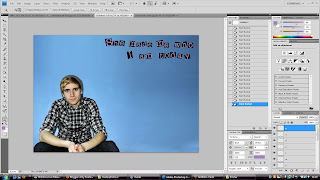
I opened the image up in photoshop using a preset setting of A3, I then rotated the canvas so that the page was landscape instead of portrait. I opened my image and then re sized it. I used 'Auto Contrast', 'Auto Colour' and 'Auto Levels' so the colours were near to live as possible. I then increased the contrast and brightness slightly to make the image more vibrant and alive.


The next step was to add my font for my double page spread. I got the font from www.dafont.com. It was under the 'type writer' subheading and is called 'Rubberstamp'. I print screened the preview and individually copy and pasted the font onto the photoshop document. I then coloured the white into the same colour purple as used on my front cover for my masthead. I used this colour because I still wanted to continue my colour theme through out my double page spread.

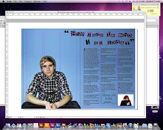
I then flattened the layers and saved the file as a jpeg and opened it up in Adobe InDesign. I have never used InDesign before so using this programme is a new experience for me. I added 3 columns for my text and started writing my interview in a Question and Answer format. I am going to add a pull quote in a bigger font and a different colour in my columns. I am going to do this because it will break down the continuous writing.


In my fourth screen grab I have continued my interview question and added a quote from the interview and made it larger and in brackets to capture the viewers attention. I also included a photo in the bottom to relate to the person who was asking the artist the question. However I do not think that it is finished yet because the other side (the left side) of my double page spread is too empty.


This is a print screen, showing a few changes i have made to my double page spread. I moved my introductory paragraph over to the other page to fill the gap and make it look more conventional. This means that there isn't as much text on the other page. So my next task will be to fill the gap with more questions and answers. I also added the magazines logo at the bottom corner of the pages as well as the page number which matches the appropriate contents page number and finally the issue month.
 After some more tweeking and improvements. This is my music magazine double page spread. I am very happy with my final result. I think it looks conventional and the page looks full and busy enough. To achieve this I moved around the text and also included the title of the artist the article is about. I also changed the font for the page numbers and issue date, again to make it look more conventional. This has worked. However I think I could still improve it.


 To improve on from my last work I wanted to break down how much text was on the page. I was also influenced by Q Magazines Cash for Questions double page spread layout. I created a banner at the top of my page to explain what the double page spread is going to be about. Using Exclusive Interview With... makes it sound and seem like it is/will be a reaccurring theme in my music magazine. So in doing this again has made my magazine look more conventional.

A few more examples of double page spreads...


 My favourite part about this double page spread is how they have included the artists name in the headline but they have done it in a very subtle way. I also like how the member they are talking to/about out of the group is clearly defined and is the main focal point because he has not been faded like the other band members.


The best part about this double page spread is the pull quote and how using the style font they have chosen and the size of it exaggerates the 'attention seeker' part of the pull quote. Again I think this is very subtly and cleverly done. I prefer these kinds of double page spreads that havent got columns and columns of lots of text. I think it is more appealing to a reader to have the text broken down. I will bear this in mind when I create my own double page spread.


Task 4


What type of DPS is this?
This is an interview Double Page Spread.
What is conventional about it?
The layout, it follows the Question & Answer format.
How can we tell the genre of music - is it obvious?
Pop style music. You can tell this due to the colours used, they look very young and girly. 
What patterns are repeated?
There is a consistent colour theme - pink and turquoise. 
What's interesting about the layout?
There is a main image covering nearly the whole page and then lots of other little images, doing this breaks down the flow of text.
What colour scheme is there?
Pink and turquoise
Does the font work - why?
Yes, the font matches the target audience age. It works well because it is very simple, young and modern.
Is the main image eye catching - why?
Yes, because the band members take up the majority of the page and they are also making eye contact with you. There are also a well known band for the target age group so if he audience see's the image they should recognize them.
Can you identify how they layout has been created in indesign?
Not particularly.
Will you repeat any of the design or layout for your coursework?
Yes, I will follow the question and answer style format.

Double Page Spread Photoshoot


Task 3

Find an example of a music magazine feature spread and label it with the correct key terms.

The masthead
The masthead is bold and done in a 'highlighted' style with the blue around the black text. This makes it easy to see what the article is about. I think that because it is done in a bright colour this attracts peoples eye to the article. It is in a bigger font then anything else on the page because it is the most important part of the magazine that people see instantly. The masthead suggests what the article is going to be about because it is the bands name 'The Teenagers'.

The sub-heading
The sub-heading says 'Young, dumb and full of...filthy tunes' It relates to the main heading because it is still about the band. Using the words young and dumb are immediately linked to teenagers hence why they have used these words. The font is not 'highlighted' and in the same font like the masthead because it is not the main text on the page.

Drop capital
The drop capital is used because it creates a nice visual effect. Sometimes they are used more then one time in an article to break up the blocks of writing. They are also used to show the start of the text. It is in black because this follows the colour theme on the page.

The first two paragraphs
Although the first two paragraphs are not readable. They are often there to introduce the band/artist and give you some background information on them. It also introduces what they may be interviewing the band about. I think this is a good idea to do because if someone reads the article who doesn't know the band, they may come to like them and want to carry on reading.

The questions
Again you cannot read what has been written, but normally in an interview with a band or artist the interview is set out in a Question and Answer style. It is done like this because it is neat, tidy and easy to read. Depended upon who the magazine are interviewing they may use formal or informal tones. However I found after looking at music magazines in shops, the majority of interviews are done in a informal and conversational style. I think they do this because you want an interview to be relaxed and as a reader you feel more comfortable reading this style of writing rather then formal writing. I also think that if you as the interviewer and are more relaxed and informal you are more likely to have a better interview and get more answers form the band/artist. The questions are often either in a different colour, bold or underlined, this is done so that the layout format is easier to understand. The questions are often to relevant to the target audience the magazine company are trying to attract.

Images
The main image is of the band featured, 'The Teenagers'. Personally I think the main image suits the bands name and the article. They are all laying on a bed, looking lazy which is what teenagers do, they don't have any sort of facial expression and are sat there 'lazying' about which again are what teenagers are known to act like. The posters stuck on the wall are not put up straight, the way they are angled are done in a clever way so that the lines of the pages draw you into the band members on the bed. Overall it is one of five images on the page but is by far the biggest image covering the whole of one page.

Pull quotes
The pull quote used says "Of course we're a sexual band. We're The Teenagers and that's all they think about" it is said by one of the band members called Quentin. It is positioned in the middle of the page again 'highlighted' like the masthead to draw your attention in. I think it proves that although the band are serious about their music they are also out just to have fun like any other teenagers.

Layout
The layout is very tidy and organised. It is not overcrowded with text and is broken down by a number of images used. On the right hand side they have a column about other band which are like the feature band 'The Teenagers'. They also in the bottom left hand corner have what looks like a ripped out note page, how it is layed out reminds me of a shopping list. With the things you need to know being listed.

Colours
One of the colours used is blue, i think they have used blue because it is stereotypically associated with boys and the band is all boys. However really blue is a colour for both genders so I think it will interest both male and female readers. The other two colours are the simple colours black and white. Using a mixture of these 3 colours creates a good contrast and all the colour looks well together and layered together. However for the advertorial NME still use their colour they are associated with which is red.

Task 2 - Planning your double page spread - Proposal


What type of double page spread do you intend to create
After researching into the different types of double page spreads there are and looking at what each type of spread includes and as well as looking at music magazines in shops. It has become apparent to me that the most used and obvious choice would be to use a Interview styled double page spread.

Explanation of how this is appropriate and relevant for your target audience and your genre of music magazine
I think doing an Interview style double page spread is appropriate and relevant for my target audience because my target audience are teenagers and young adults. I think and believe that people of this age aspire to be like someone especially if they are their role model/idol, and having a question and answer interview style double page spread helps the reader find out information about the artist or band. I think an Interview style will also suit my chosen genre of music which is Indie because Indie kids really aspire to become famous and well known or at least stereotypically people think this.

How you intend to incorporate original images
I think the best way to incoporate my images and have enough space for text would be to have one image covering one page with a possible smaller image included on the other page of the double page spread. As I am doing an interview I could use pictures instead of intitals or names of the band memebers just to make the interview and layout look a bit more interesting.

How will you obtain information and images for your feature spread
To obtain information for my spread I will do some research into other double page spreads, especially Interview styled double page spreads as this is the style I have chosen to follow. I will arrange another photoshoot with the same model who was on my front cover and will do another shoot for my double page spread.

What visual style you would like to achieve
I would like to achieve a simple yet affective style. I want it to look modern because it needs to attract the younger audience, I will do this by using a san-serif font.

What style of writing you intend to use
I intend to use colloquial, chatty and informal styled writing. I have chosen to do this because as a reader I enjoy reading magazines when you can understand what they say because they use simple words. Also because it's in a informal style you feel you can connect with the person who they are interviewing.

Double Page Spread Flatplan

Double Page Spread
This is a flat plan for my double page spread. After looking up into double page spreads from music magazine it has become clear that there often is one big picture which covers one page of the double page spread.
The album review will be of the band that will be on the double page spread. The text within my double page spread will be general background on the band and an interview style question and answer.
I chose to add a puff to the page because readers scam through and if anything catches their eye they are more likely to read what is on the page.
In the top left I included a tab because if people where to pick up the magazine and flip through they may see this and it will interest them in buying the magazine. It will say 'Interview' with the bands name underneath. I also included the page numbers because this is basic practice.

Task 1

What is a double page spread?
Exactly what it sounds like! It is two facing pages containing appropriate material which is intended to be viewed together ( so there should be a consistent design statement) It is often abbreviated to DPS. It could also be referred to as a 'feature spread'.

There are many different types of double page spreads or feature spreads. These are examples of a few of them:
  • A poster styled double page spread. The key features of this style would be who the poster is of or something relating to the story.A poster normally covers one page of a double page spread or the whole double page spread. Could be very suitable for my music magazine if the photograph was of a relevant indie artist or band.
  • An interview where an individual or group are questioned and responses could be written up in a question and answer format or as a continuous prose. Could be highly suitable if interview subject is from a band who are popular with my target audience.
  • An album review with a star rating, a picture of the album and comments about the album. Could be written up as bullet points or separate paragraphs. You could have a spread on one band on their many albums or perhaps a variety of album reviews from different indie artists or bands. This type of double page spread would go well with my magazine genre - indie. But if I chose this type of double page spread I think I would use a variety of different work by indie artists.
  • You could use the same idea as the album review but this time concentrate on one album with a song-by-song review. Each song could be sectioned off from each other, you could include comments people have made about the chosen song. You could also include the lyrics for the song. This would work well if you also had written why the chosen indie band/artist wrote this song and what the deeper meaning of the song is. Where they got influence from etc possibly also done in a question and answer style format.
  •  A Photo shoot type double page spread. Where a band/group or artist have many photos of them spread across two pages. I don't think it would be very suitable for my music magazine double page spread because I think it needs text included, especially because of the pull quote "She ruined my life" written on my front cover. I think there needs to be reference to this visable.
  • A gig/festival double page spread. This is a feature page that advertises the different concerts by different bands that are on. These include the bands name, dates, places, where to get tickets from and band websites and their information.

Change 2

The final change I made was changing the image in the top corner because I changed my front cover. I also included the date of the issue because this is a conventional aspect that continues through out magazines.

Change 1

Here are two screen grabs including my before and after the changes I had made to my contents page. My original looked unconventional because of the large open space under the contents. So to fix this problem I moved the white box and the font to under the contents page. This has worked well in two ways. The first being that it fills the empty looking gap and the second being that the white border breaks down the continuous list of writing. I then moved the You Me At Six cover line down so I could fit in a screen grab of my front cover. As written in my diary this was influenced by Q magazine. The fact that there is another image on the page alone makes it more conventional. Personally I think the change has worked.

Original                                                                                                          Changed

Friday 4 February 2011

Diary

What I have done today 28/01/2011...
Today I started work on my contents page, I used the image I uploaded and included the appropriate cover line that I mentioned. I am very happy with how my contents page is coming on. It has all the conventions of a music magazine contents page and it has followed my flat plan and looks correct and appropriatly layed out.

What I have done today 04/02/2011...
Today I have continued work with my contents page. I completed my final contents page. But after looking at it and thinking of ways to improve it. I have slightly changed the layout of my contents page. I moved the issue date to under the contents page to fill the gap and I included a screen grab of my front cover. This again was influenced by Q. Here is an example from a Q magazine...

Friday 28 January 2011

Contents Page Construction

 This is my first screen grab  it was taken about  45 minutes into my first lesson on my contents page. I used the same font called 'Elektrodisiac' as I did for my masthead on my front cover. I wanted to keep my music magazine style running throughout my pieces. This is the reason why I still used purple and white as my main colours because these are the colours I used on my front cover. So far i have fit my picture onto an A4 sized dimension file. I have also included my contents page. I also included my main cover line which links into my only image used on my front cover. 
This is my second screen grab of my contents page.  I have included a banner in the top right corner to fill up the space. I also started testing with the font and colours I am going to use for my contents page text. Personally I am very happy with how the layout looks. Some other cover lines that I am going to use. Here are a few examples : I.D Lounge, Interview with Matt White - Talks about his positives and negatives of his relationship and his past. 


                                                                              This is my third screen grab of my contents page. It shows how far I have developed my contents page. You can see that it is really starting to take place. I have included most of my cover lines and extra text. 
For the numbers I again have used the same font 'Elektrodisiac.' with FX on them to create the white glow. The settings used were:
White glow, Opacity 75, Spread 6, Size 21, Range 50.
For my cover line font I again used the same font for my cover lines that were on my front page called 'Thornburi." I chose this font because its easily readable. 

This is my fourth screen grab for my contents page. I finished off adding my cover lines and added a border at the bottom of my page, this was influenced by Q music magazines layout. I also included my music magazine website at the bottom of the page and my logo from my front cover.
I think I will try and improve my page by moving the banner to under the contents page and putting in its place a screen grab of my music magazine which again is influenced by Q.


Tuesday 25 January 2011

Contents Page Image

This is the image I am going to use for my contents page, I have chosen to use this image because it was taken at a concert and links in with the indie genre. I am going to include a relevant pull quote or cover line with this image, with a page number next to it.
The reason I believe this image will work is because of the black background. The black and white image follow my colour theme for my magazine and the writing will also be white and purple to continue the colour theme.
An idea for the cover line is - "YMA6 release new single - Rescue Me"

Friday 21 January 2011

Diary

What I Did Today ... 21/01/11

Today I finished off my music magazine front cover. I uploaded step by step screen grabs to show my progress  through out creating my front cover. In the final shot I wrote about the improvements I made. To complete my construction of my front cover I finally made a post including only my final front cover.

Final Front Cover

Final Change


After going back to my previous work I decided that I wasn't competely happy with my final front cover. I felt that there was more I could do with the left over space and gaps available. As well as experiment with the font some more. So this is what I did. I moved around the layout of my cover lines. I started off by making my main cover line bigger, which was also the feature artist. I added a box to make the quote stand out. I also added a few more cover lines to make the page look 'busier' hence making it more conventional. I also experimented with different fonts so that the text did not look so similiar. The new and changed front cover will be my final front cover.

Friday 14 January 2011

Diary

What I have done today 14/01/2011...
Today I started work on my music magazine front cover. I have used Photoshop to do this. I completed my masthead and barcode and have started work on my cover lines. Next week I will continue work on my cover lines and add a puff/plug.

Front Cover Construction

This is my first draft of my front cover this was taken roughly about 45 minutes into the lesson.  I had uploaded my photo into Photoshop and included my barcode, which I dragged from .
I also started work on my magazine logo. The font I used for my masthead was called 'elektrodisiac' because the font was so thin I layered 4 pieces of the same text near each other to 'bulk' up my magazine name and make it bolder.  So far the tools I had used were the text tool and the rounded rectangle tool.


This is my second draft this was taken about 1 hour and 30 minutes into the lesson. I completed my barcode by adding the issue month, price, website and issue number.
I also added my tagline 'Independent Identity' to my masthead. The font I used for this was called Gill Sans.
I also made a start on my cover lines I used a deep purple font colour because purple is part of my colour scheme, however the writing did not stand out very well so I added a white outer glow to make it stand out. I believe this effect has worked.


This is my third print screen of my front cover. This was taken half way into my second lesson on my front cover. I added a pull quote and another cover line. All of them are still in a purple coloured font because i wanted to continue my colour theme. The font I used on all my cover lines was called 'Thornburi'.  I also included a puff/plug in the bottom left hand corner.


For the last half of the lesson i wanted to improve my magazine. I moved the puff/plug too the top right hand side because it covered some of the gap that was there. This meant that I had room on my left third, so I added another tag line "New Found Musical Mysteries" and then spread my cover lines out.

Front Cover Image

 These 3 images show the stages of my editing. I edited my images on Photoshop CS4.
The smaller image is my original image. My first step of editing was correcting the contrast and colour by using 'Auto Contrast' and 'Auto Colour'. I then needed to get rid of the shadowing so using the 'Spot Healing Tool', 'Healing Brush Tool', 'Eyedropper Tool' and the brush tools with various sizes and hardness.
The next stage was to soften the face I did this by removing blemishes and then using the blur tool to create a smooth looking texture.
The final steps to create my final image were, firstly, I wanted to create dark corners of my image so I copied the layer as a 'curves' layer. Set the curves so the page was black I then used the radial gradient tool and drew a line from the centre of my image to the edge. This created the dark edging effect, however it also darkened my image. So the second final stage was to brighten the image and increase the contrast. Finally I flattened the layers and this was my final image. (the image on the right-hand side of the page.)
Overall to create my final edited image it took around an hour and a half. I am pleased with my final image and am going to use this as my final image for my front cover on my music magazine.